StreetSmart
A travel app concept helping users discover authentic experiences with peace of mind — validated with 11 participants and a 4.48/5 satisfaction score.
Mobile Design

Overview
Role: UX Researcher & Designer (Design Lead)
Team: 5-person Collaborative Team - Project Manager, Research Lead, Design Lead, Prototyping Lead, Evaluation Lead
Timeline: 16 weeks | Academic Capstone Project
Tools: Figma, Photoshop, Illustrator, Google Forms
StreetSmart is a mobile travel app built to solve a problem existing apps haven't cracked: helping time-constrained travelers find authentic, local experiences without hours of research or the anxiety of navigating somewhere unfamiliar. I led the design work across the full 16 weeks — from research synthesis through high-fidelity prototyping — in close collaboration with a team of five.
The Problem
Most travel apps are optimized for popularity, not personalization. For travelers with only 2–4 hours of free time per day, the gap between "I want something authentic" and "I know where to go right now" is enormous — and no existing app was closing it.
Three gaps kept surfacing across every user we spoke to: generic recommendations that buried local experiences, no support for spontaneous in-the-moment decisions, and a memory documentation burden that made journaling feel like work instead of part of the trip.
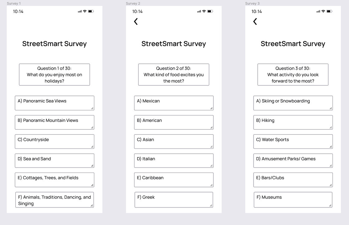
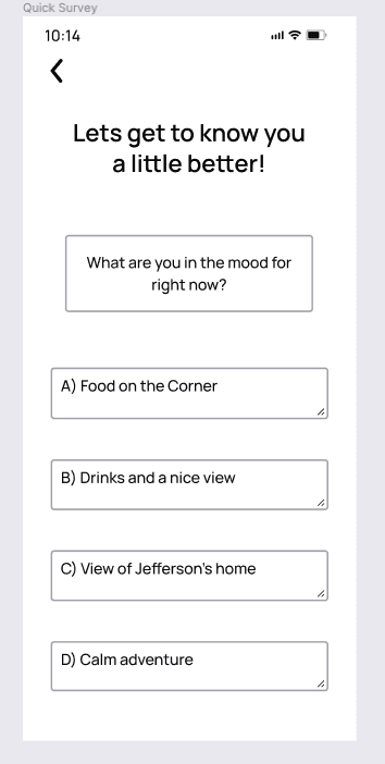
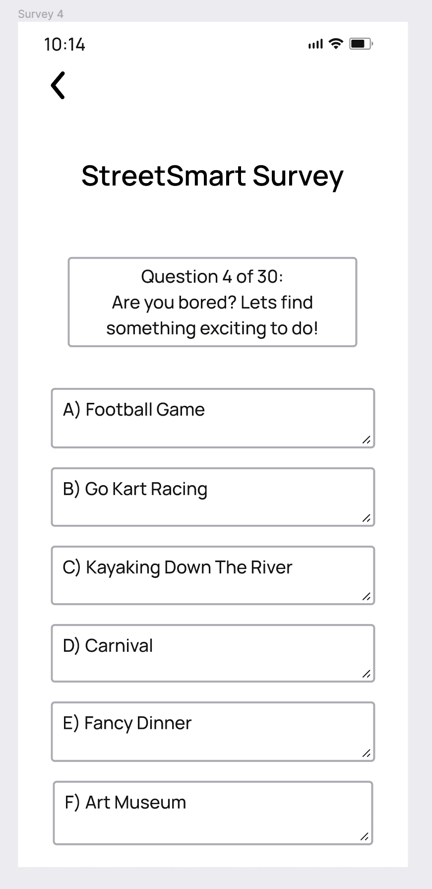
Research question: How might we help travelers discover personalized, authentic local experiences while reducing planning friction and documentation burden?
Research
Working alongside our Research Lead, the team conducted 10+ contextual inquiries with business and leisure travelers — observing real planning behavior rather than asking people to recall it. We synthesized over 100 insights through affinity diagramming, which the team used to identify patterns across very different user types.
Work Activity Notes captured in natural settings — documenting real travel planning behaviors rather than recalled ones.
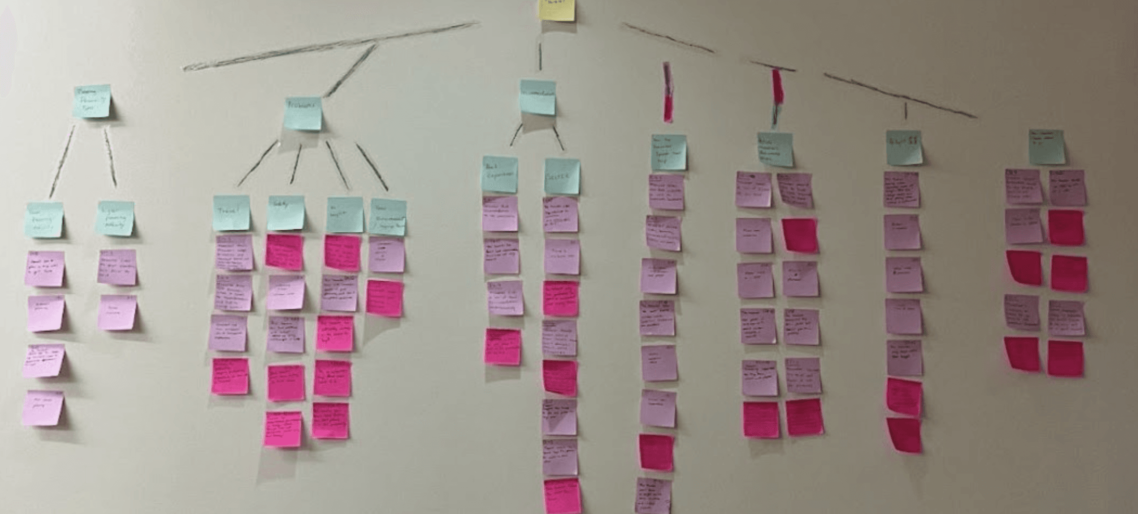
Affinity diagramming session — synthesizing 100+ insights from contextual inquiries across business and leisure travelers.
The six themes that shaped our design:
Time scarcity with exploration desire — travelers had limited free time but wanted experiences that felt meaningful. "I don't want to waste my limited time on tourist traps."
Authenticity over popularity — users wanted hidden gems, not the same spots on every travel blog.
Spontaneity vs. structure paradox — users needed flexibility for in-the-moment decisions but also structure for reservations. These felt like opposing needs until we looked closer.
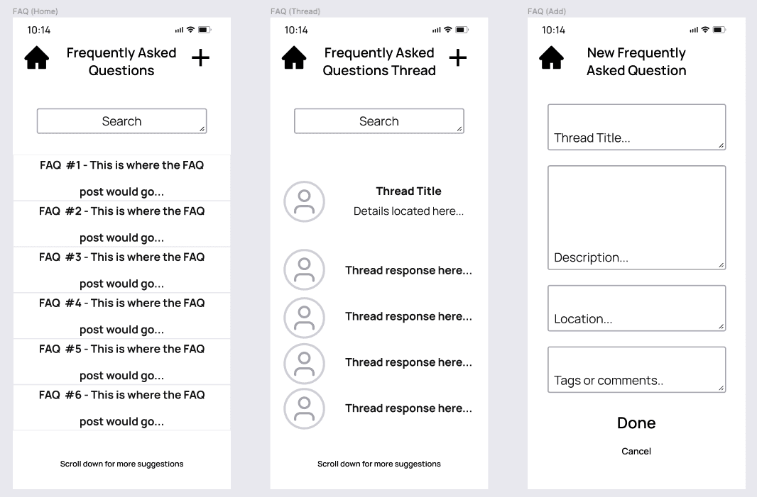
Memory documentation friction — 9 out of 10 participants struggled with post-trip organization. In-trip journaling felt like work interrupting the experience.
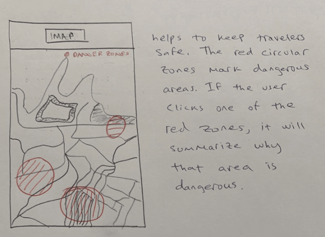
Safety as an invisible priority — travelers unconsciously assessed neighborhood safety but had no reliable data to support it.
Budget flexibility — business travelers were less price-sensitive and more focused on quality and convenience.
Personas
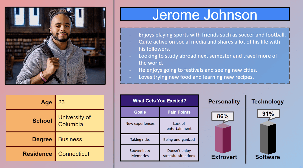
Jerome Johnson — primary persona. A spontaneous, tech-savvy university student planning his first study abroad trip.
Three personas emerged from the research. The team aligned on Jerome Johnson — a spontaneous, tech-savvy 21-year-old university student — as our primary. He represented the user who would push the design furthest: someone who needed real-time decision support and authentic discovery, not just a list of attractions.
Design & Iteration
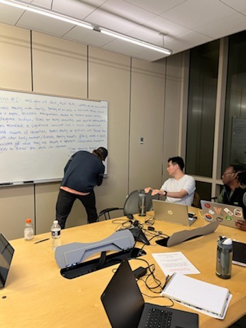
Design studio session — each team member sketched independent solutions before the group evaluated and combined the strongest ideas.
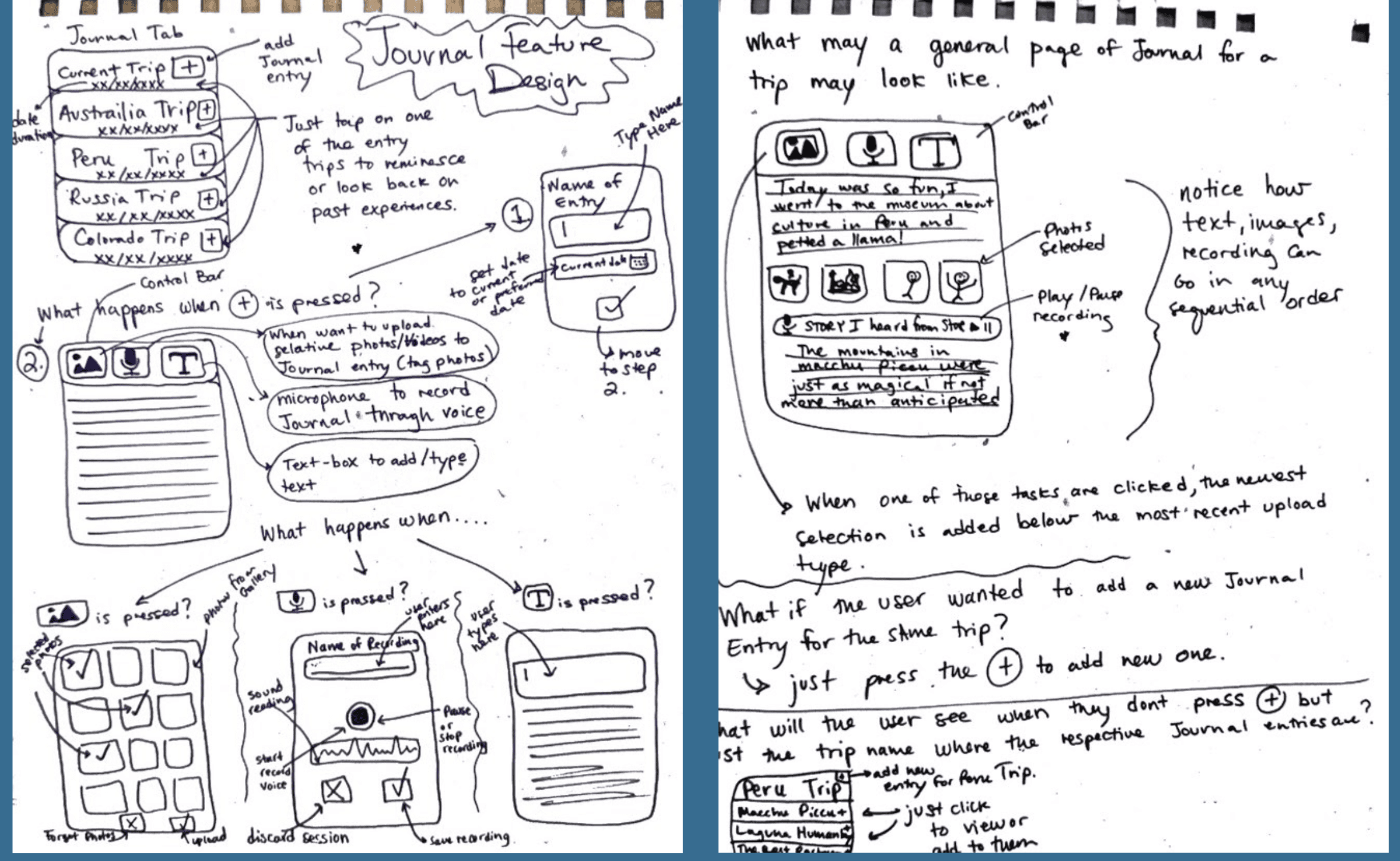
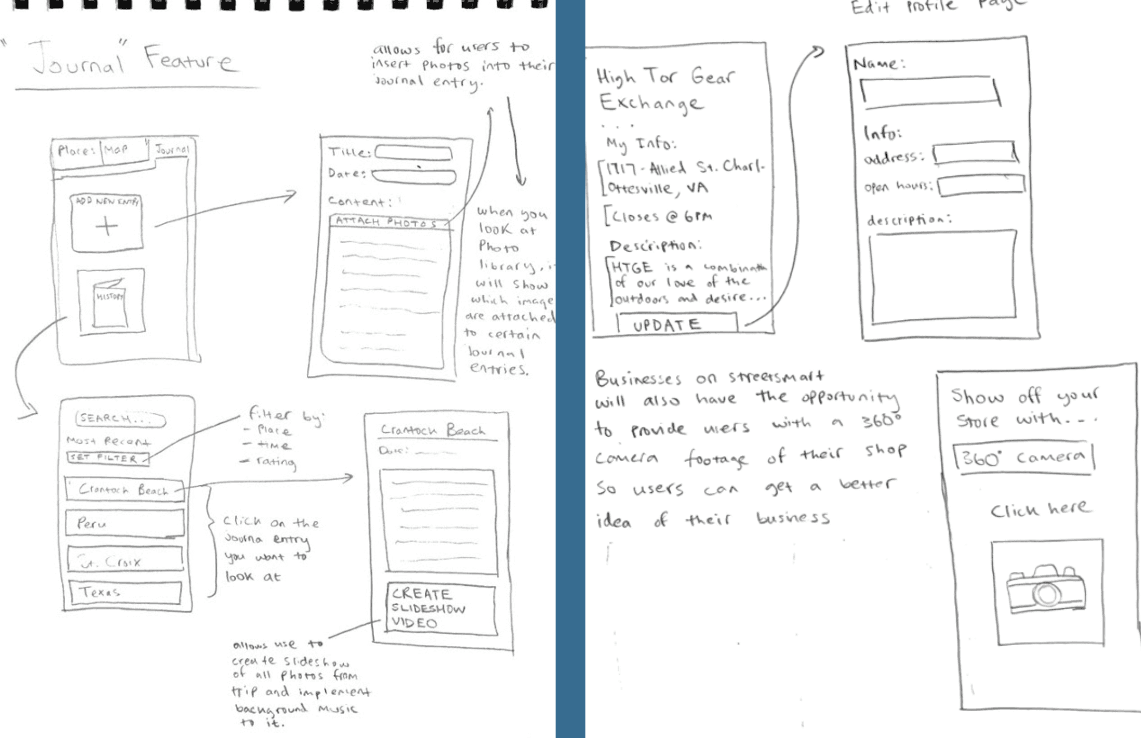
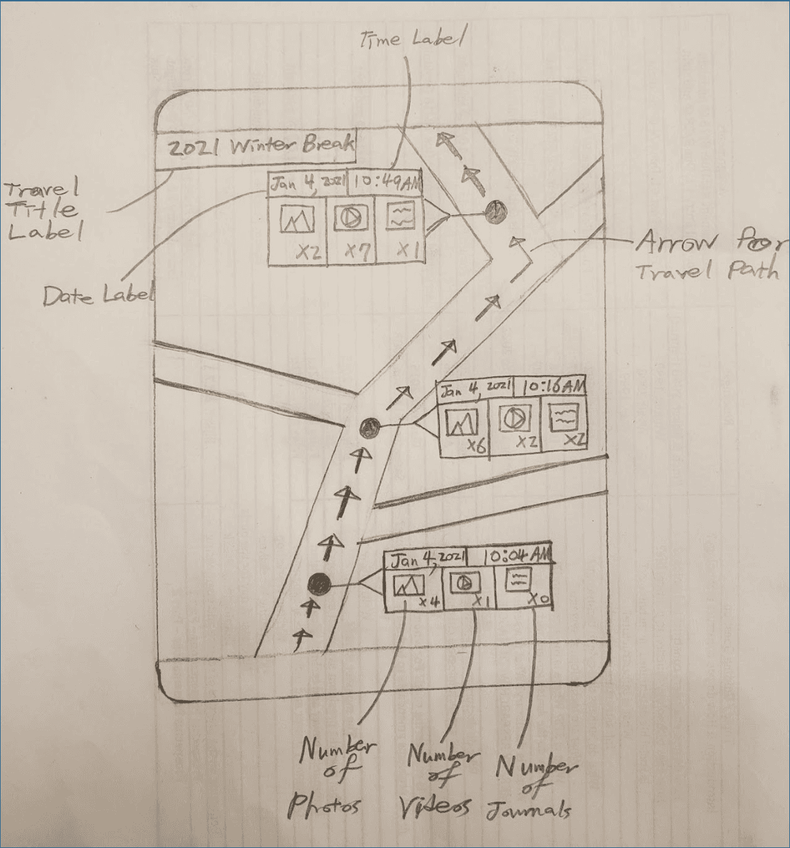
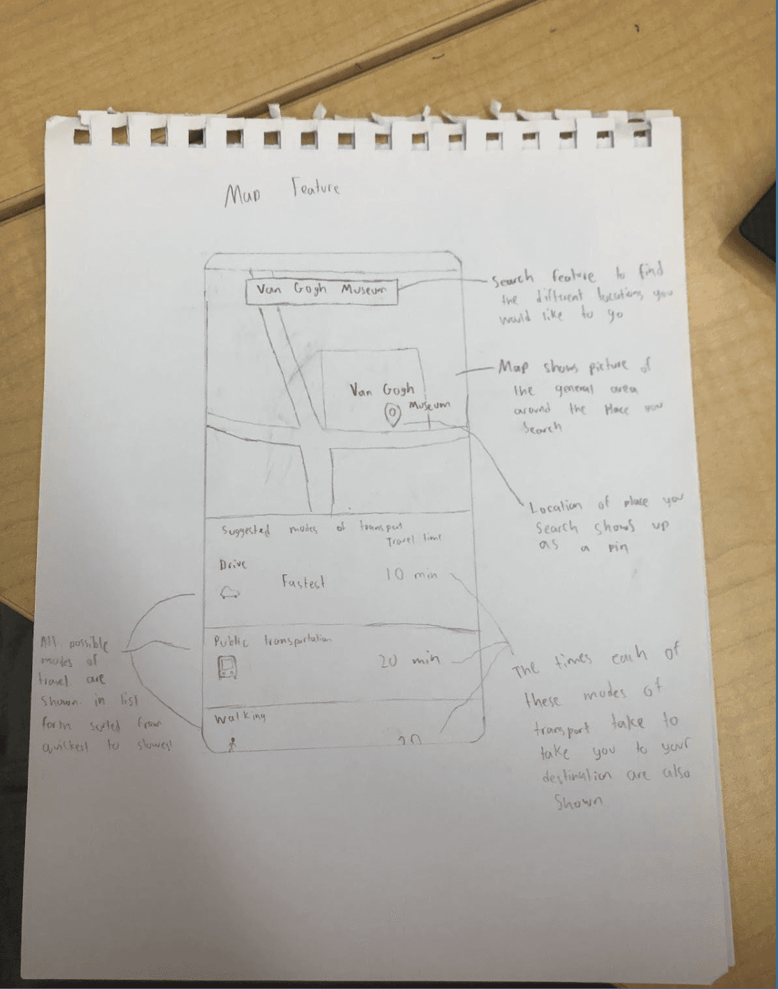
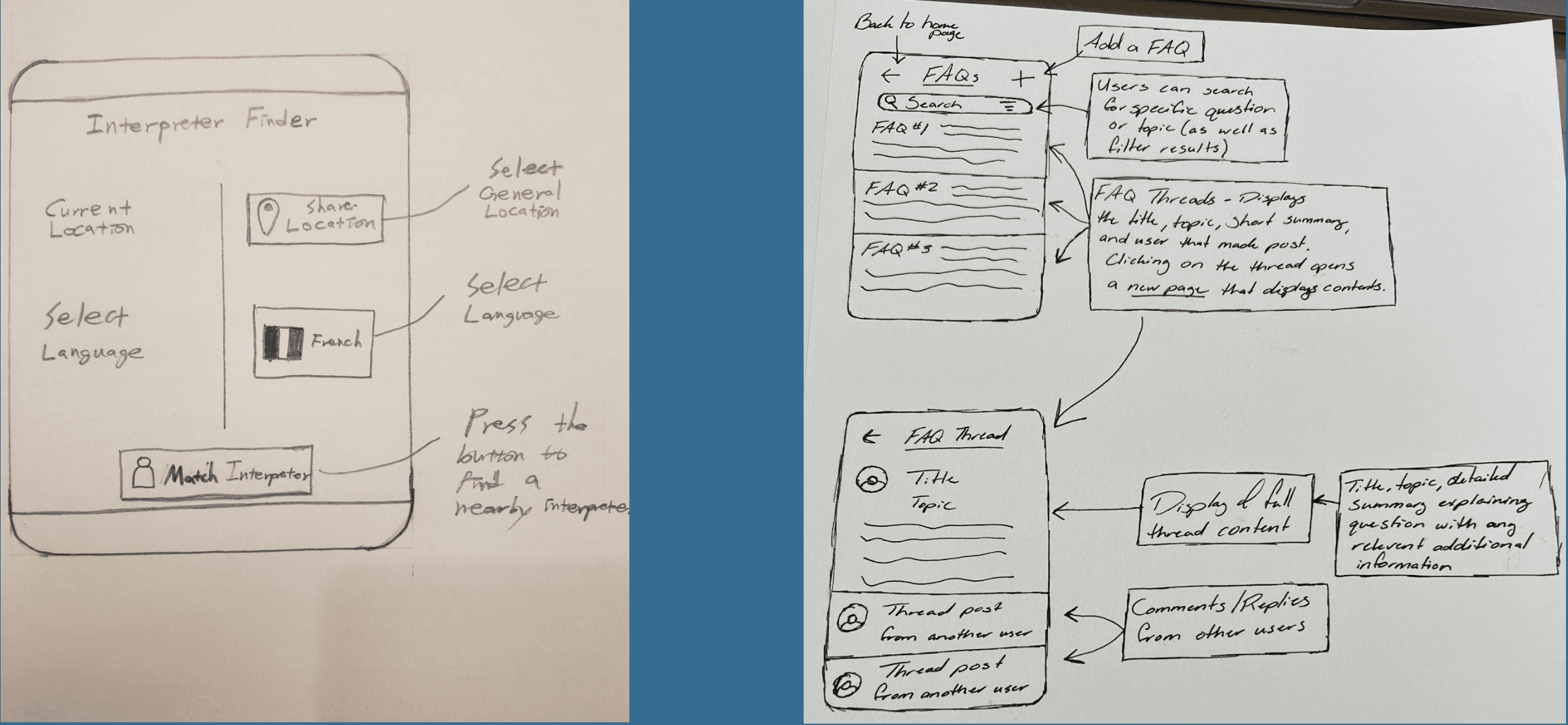
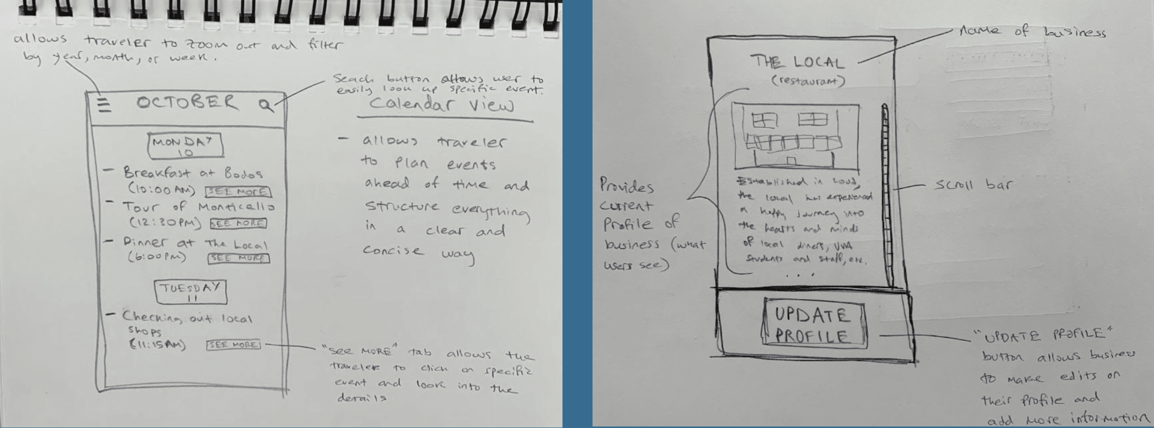
Early concept sketches exploring navigation structure, filter flows, and journal entry interactions.
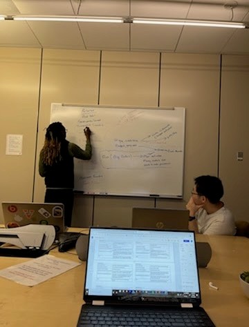
The team ran structured design studio sessions where each member sketched independent solutions before the group evaluated and combined the strongest ideas. One principle emerged consistently across every session: the app needed to feel like a trusted companion, not a search engine.
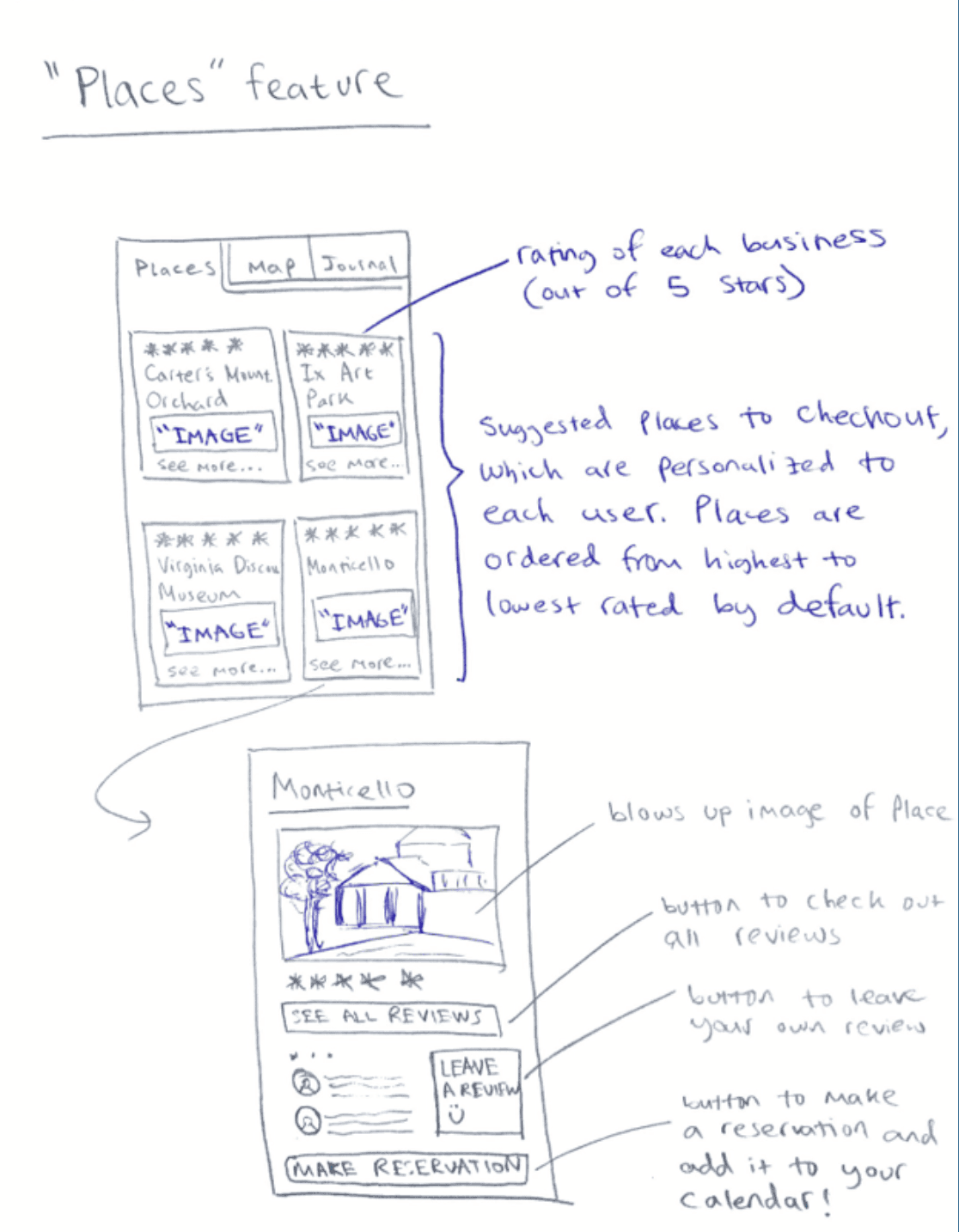
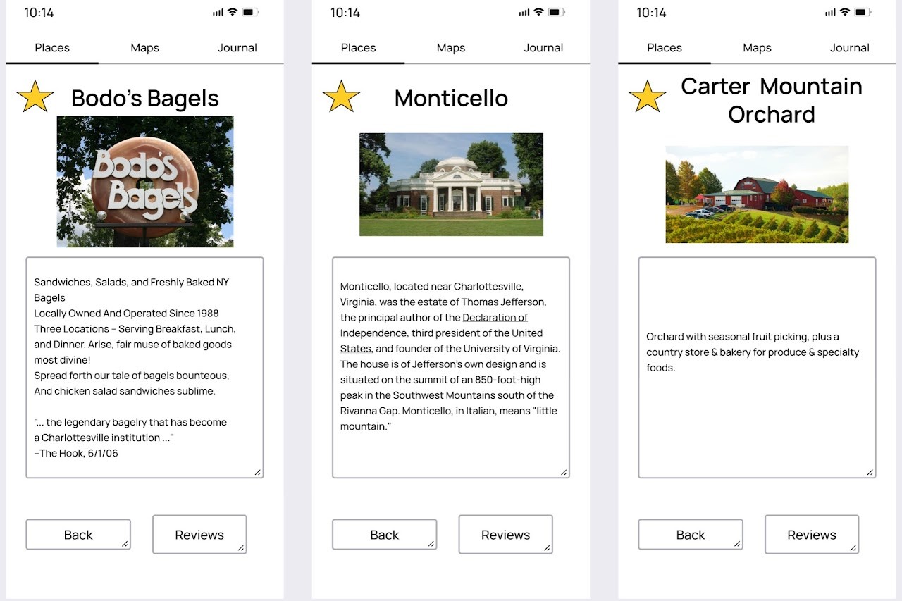
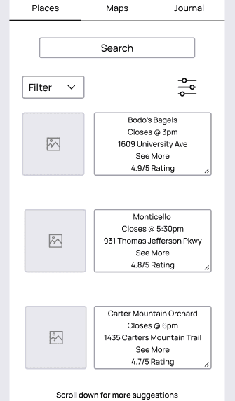
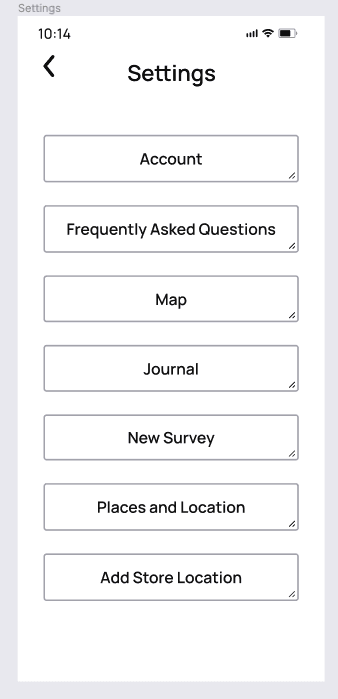
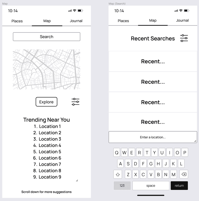
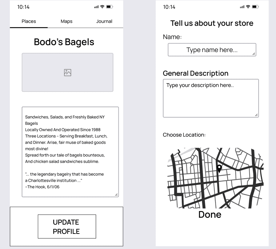
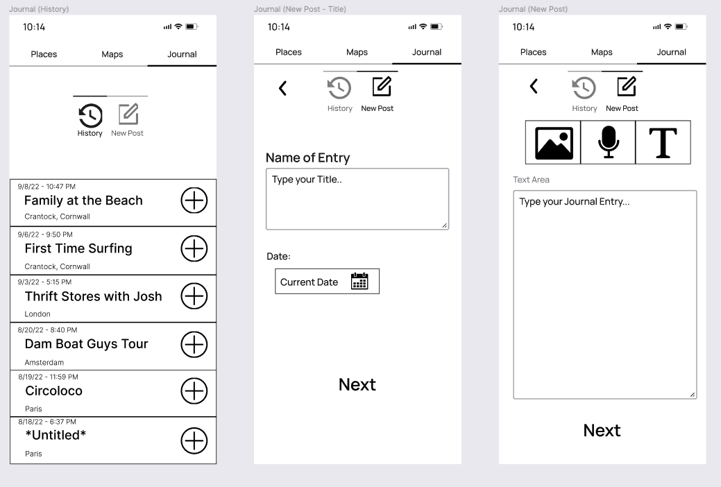
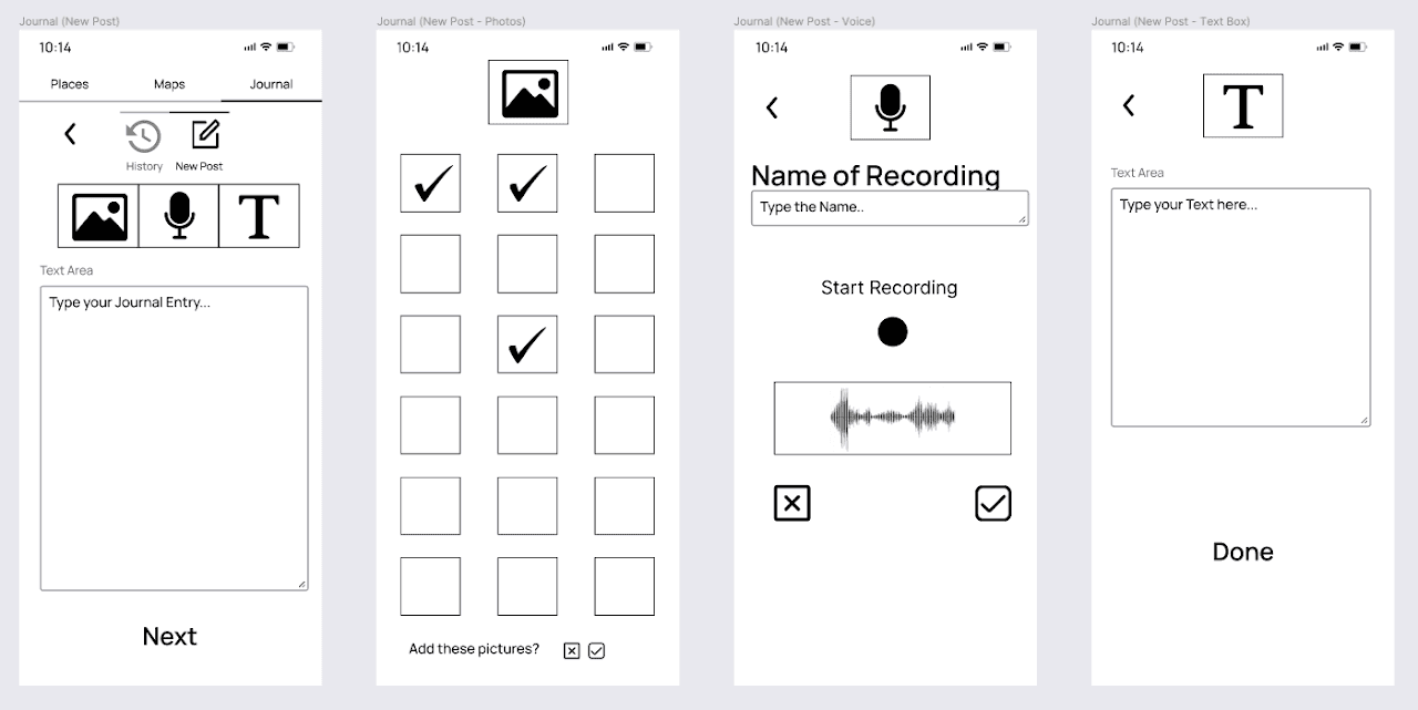
That became our guiding metaphor — "home away from home" — and shaped the three-tab navigation structure that anchors the experience: Places for discovery, Map for location and safety awareness, Journal for memory capture. The naming was deliberate. Vernacular labels that users understand immediately without learning the app's logic.
The most significant iteration came mid-process. We originally included a full calendar feature. Client feedback was fast and consistent: "I already have a calendar app." The team cut it and replaced it with a Wishlist — a lightweight bookmarking tool using a familiar star metaphor that required no explanation and tested well across all user groups.
The journal sharing feature went through similar refinement. Students wanted social sharing; the client pushed back on privacy. The team implemented granular privacy controls — public, friends only, or personal — so users could share selectively without the default being public exposure.
Low-fidelity wireframes built in Figma — mapping core flows across the Places, Map, and Journal tabs before moving to high-fidelity.
Final Design
[add hi-fi mockups when available... Recommended screens: onboarding survey, Places tab, Map with safety zones, Journal entry, Wishlist]
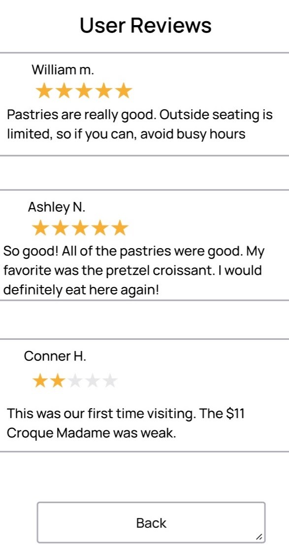
The final prototype covered 30+ screens across all three core flows, built collaboratively in Figma with the Prototyping Lead handling implementation while I focused on interaction decisions and visual consistency.
Results
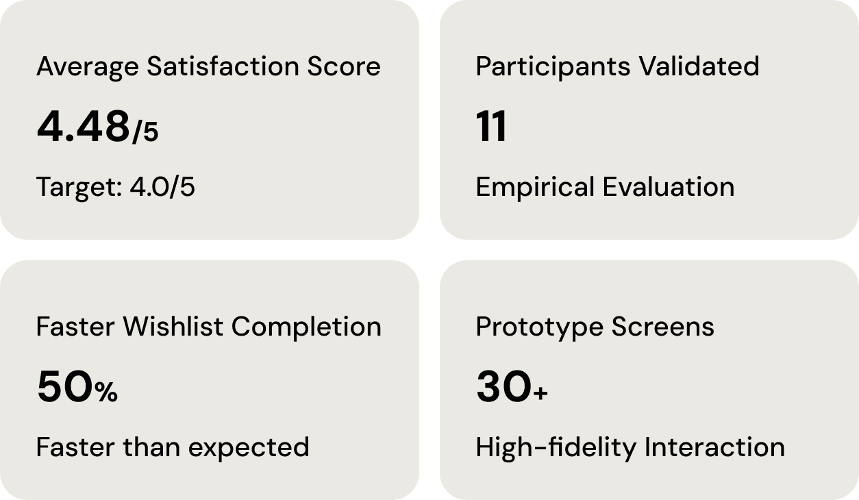
Every usability target was met or exceeded across intuitive labeling, instruction clarity, button-task matching, and layout efficiency.
Reflection
The research phase is what I'm most proud of on this project. Synthesizing 100+ insights from contextual inquiry — as a team, across very different user types — and tracing each theme into a specific design decision is the kind of grounded process I want to bring to every project I work on.
The calendar removal was also a formative moment. The data was clear, but making the case to the team and moving quickly once the decision was made taught me something about how good design actually gets shipped — it requires alignment, not just good ideas.
Next Steps
Longitudinal testing with real travelers to validate results beyond a controlled evaluation
AI-powered recommendation refinement that learns from in-trip behavior rather than relying solely on the initial preference survey
Accessibility features for travelers with disabilities — a gap the current design doesn't address