LinkedIn Redesign
Redesigning LinkedIn's job search for first-generation job seekers who face hidden barriers in the hiring process — grounded in 25 survey responses and 4 user interviews.
UX Research

Overview
Role: UX Researcher / UX Designer (Solo)
Timeline: 8 weeks (Fall 2025)
Tools: Figma, Qualtrics, Miro, Lovable AI
Platform: Mobile
LinkedIn dominates professional networking, but for first-generation job seekers, it often does more harm than good. The platform wasn't built with them in mind — and it shows. This project investigates where and why the job search experience breaks down for users who don't have the insider knowledge that most hiring platforms quietly assume.
The Problem
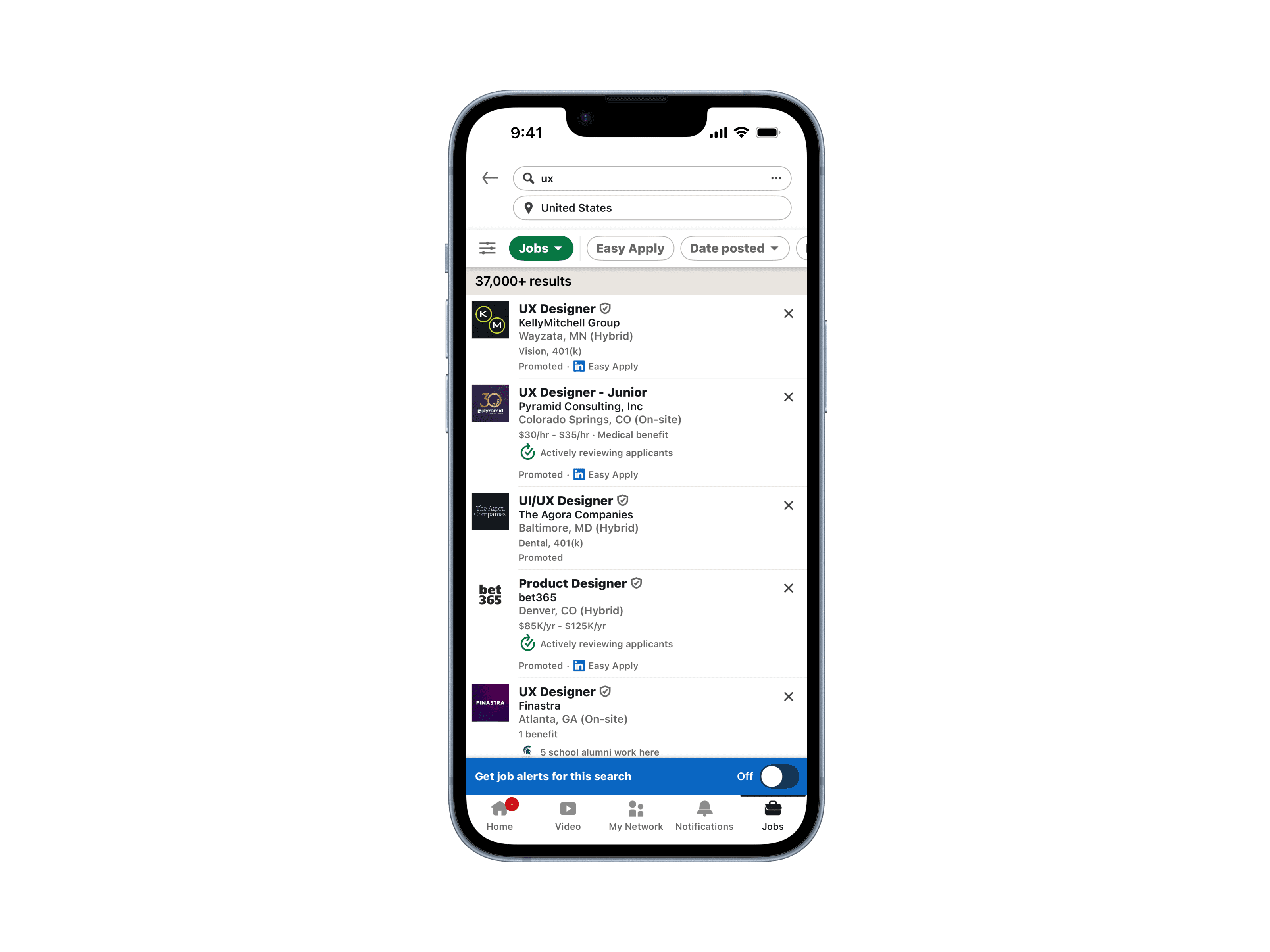
For first-generation and non-traditional job seekers, LinkedIn's job search is a minefield of ambiguity. Inconsistent job postings, opaque recommendations, and an overwhelming interface make it nearly impossible to build a clear picture of where you stand or what to do next.
The result isn't just friction — it's self-doubt. Users don't just struggle to navigate the platform; they start to question whether they belong in the roles they're applying for.
Project Goals
Pinpoint where LinkedIn's job search breaks down for first-generation and non-traditional users
Understand how users interpret — and misinterpret — job listings and requirements
Evaluate whether LinkedIn's recommendations actually reflect who users are
Turn research findings into concrete, testable design improvements
Research Approach
I used a mixed-methods approach because the problem had two layers: what users were doing, and how they were feeling while doing it. Surveys captured the emotional and attitudinal side — I collected responses from 25 participants via Qualtrics. Interviews and usability testing got to the behavioral reality underneath, with 4 user interviews conducted to explore mental models and decision-making in depth.
Methods
User Surveys — measured confidence levels, emotional state, and perceived challenges across the job search journey
User Interviews — surfaced mental models, hidden assumptions, and how users made sense of job postings
Usability Testing — observed real sessions to catch where the experience actually broke, not just where users said it did
Participants
First-generation college graduates
First-time job seekers
Non-traditional job seekers
Career switchers
Recent graduates
These aren't edge cases. They represent a large segment of LinkedIn's user base who are consistently underserved by the platform.
Survey Insights (Quantitative Findings)
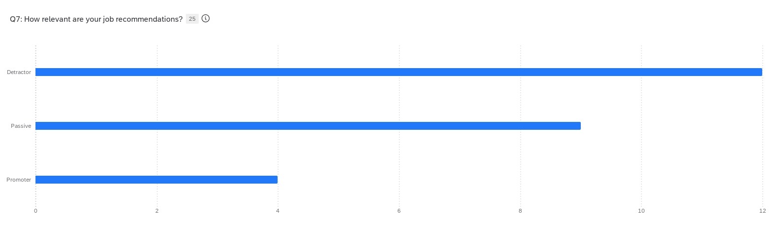
48% of participants said LinkedIn's job recommendations didn't match their skills or goals
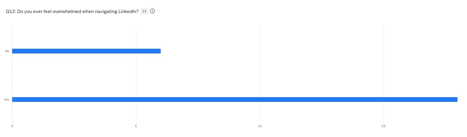
75% reported feeling overwhelmed while using the platform's job search features
Numbers like these don't point to a learning curve problem — they point to a design problem.
Key Findings
Finding 1: Job postings create more confusion than clarity
Users couldn't reliably tell whether they were qualified for a role. Descriptions were dense, inconsistently formatted, and often mixed must-have requirements with nice-to-haves — leaving users to guess. The most common response wasn't confidence or rejection, it was paralysis.
"I don't know if I'm underqualified or if they're just asking for too much."
Finding 2: Recommendations feel random
Recommended jobs routinely missed the mark — wrong experience level, irrelevant industries, roles that had nothing to do with what users were actually looking for. Over time, users stopped trusting the feature entirely and resorted to manual searching.
Finding 3: The interface itself is exhausting
It wasn't any single element. It was the accumulation of competing modules, an unclear hierarchy, and notifications pulling attention in every direction. By the time users got to a job listing, many were already worn out.
75% of participants reported feeling overwhelmed during the job search experience
Insights
Insight 1: Users can't build a reliable mental model
When the platform behaves inconsistently — different posting formats, unpredictable recommendations, navigation that shifts — users can't develop intuition for how to use it. Every session feels like starting over.
Insight 2: The recommendation system ignores how non-traditional careers actually look
LinkedIn's matching logic is built around linear career paths and standard job titles. It doesn't know what to do with transferable skills, career gaps, or unconventional experience, which describes a significant portion of first-generation job seekers.
Insight 3: Cognitive overload isn't just annoying — it undermines confidence
When users are overwhelmed, they don't just slow down. They start making worse decisions, second-guessing themselves, and disengaging. The interface is actively working against the people who need the most support.
Personas
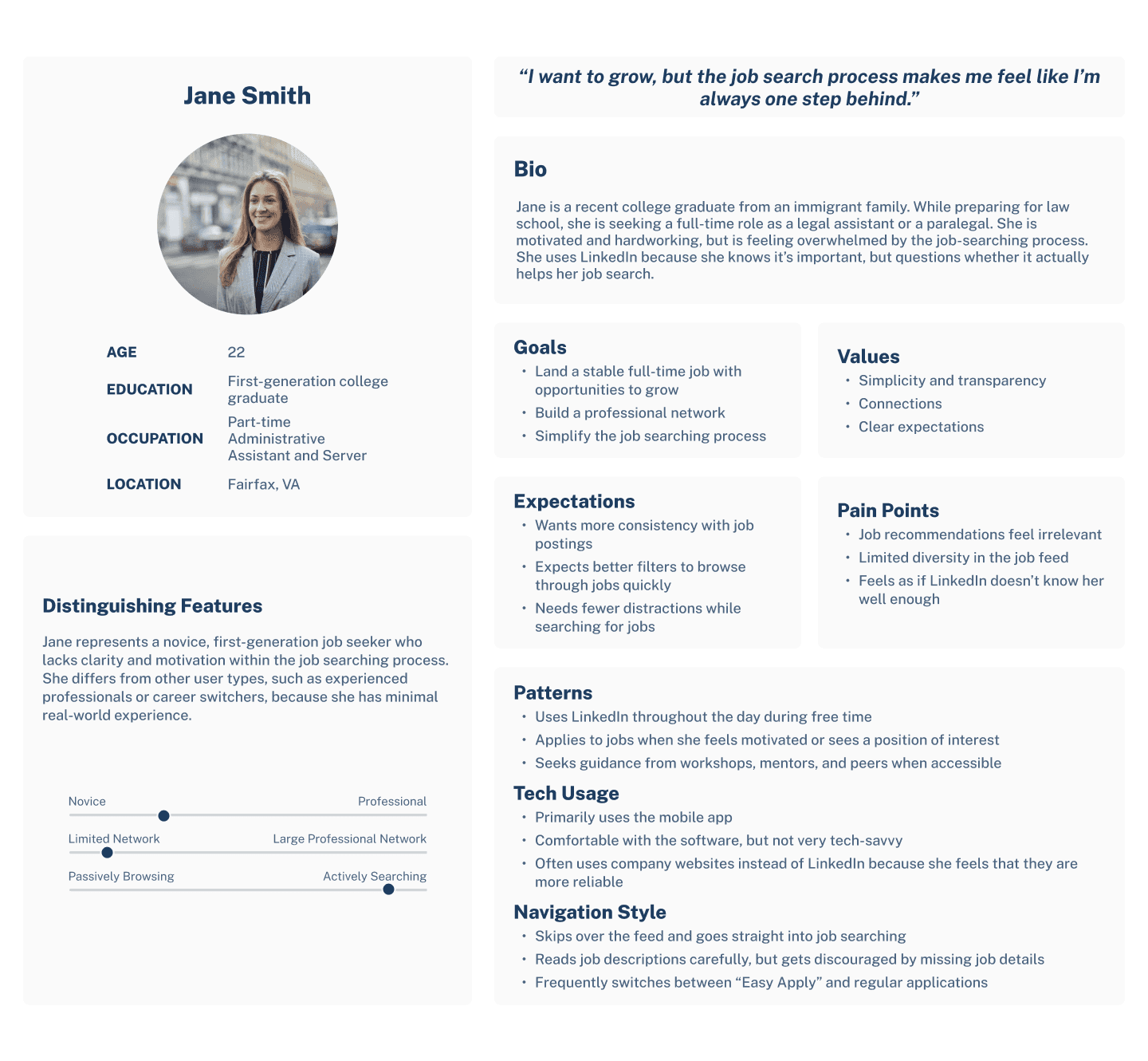
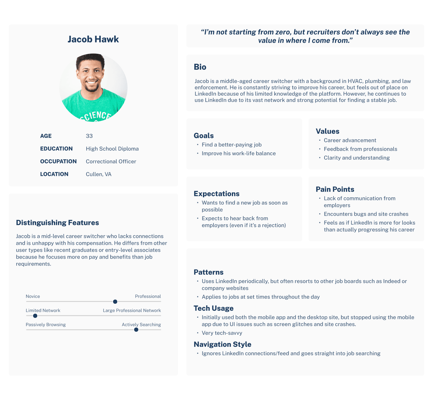
Two patterns emerged clearly enough to anchor the design work:
The First-Generation Job Seeker — motivated and hardworking, but constantly second-guessing fit. Lacks the professional network or insider context that makes LinkedIn feel intuitive to others.
The Career Switcher — experienced and capable, but invisible to a recommendation system that relies on job titles and linear progression. Their skills don't map neatly to the platform's logic.
Task Flow: Applying for a Job on LinkedIn
Mapping the current application flow made the friction points impossible to ignore. Users weren't struggling because the process was long — they were struggling because it was unclear. At nearly every decision point, the platform offered ambiguity where it should have offered guidance.
Journey Mapping

The sharpest drop in user confidence happened during the qualification assessment phase — the moment users tried to decide if they should apply. That's a critical juncture, and the current design offers almost no support.
Design Recommendations
To bring these recommendations to life quickly, I used Lovable AI to generate initial UI concepts, then refined and annotated the screens in Figma to align them with my research findings. The focus was on communicating the design decisions clearly — not on production-ready code.
One decision I revisited mid-process: the initial filter redesign grouped all options into a single expanded drawer, which, in hindsight, just moved the overwhelm rather than reducing it. By switching to a progressive disclosure model, where only the most critical filters appear first, it better matched what users actually described needing: a starting point, not a configuration panel.
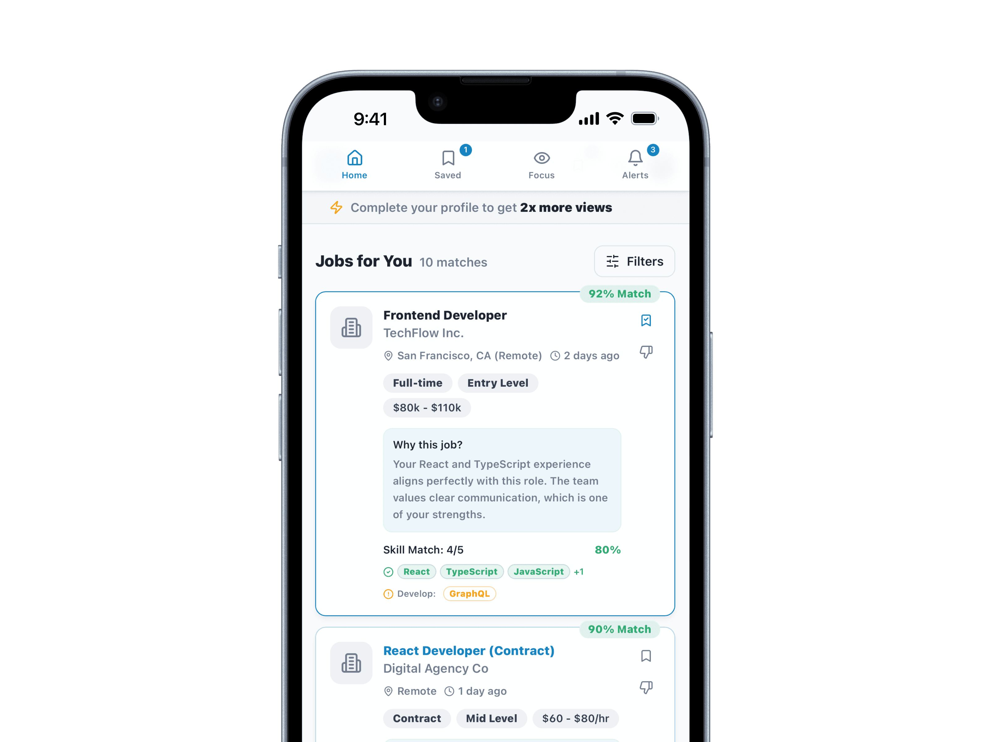
Recommendation 1: Make job postings easier to read and act on
Before: Requirements buried in dense paragraphs with no visual hierarchy — users can't tell what actually matters.
After: Match score and tiered requirements surfaced upfront — qualified or not, users know in seconds.
The redesigned job card leads with a match score and breaks requirements into two clear categories: skills the role requires and skills that are preferred. Key qualifications are pulled out of the body text and surfaced upfront so users can assess fit in seconds rather than reading through paragraphs to piece it together themselves.
The goal wasn't to make job postings prettier. It was to give users enough information, organized clearly enough, that they could make a confident decision about whether to apply.
Design decision: Separating must-haves from nice-to-haves directly addresses the paralysis users described in interviews. If you meet the core requirements, you should know that immediately.
Recommendation 2: Make recommendations feel earned, not random
Before: Recommended jobs with no explanation — users have no idea why they're seeing what they're seeing.
After: Each recommendation shows the skill or experience that triggered it — transparent, not algorithmic.
The redesigned feed surfaces the reason behind every recommendation. Each card shows which of the user's skills or experiences triggered the match — turning a black box into something transparent and trustworthy.
Users can also update their preference profile directly from the feed, so adjusting what they see doesn't require digging through settings.
Design decision: Transparency rebuilds trust. When users understand why a job was recommended, they're more likely to engage with it — and more likely to trust the next one.
Recommendation 3: Reduce the noise
Before: All filters presented at once — more configuration than exploration.
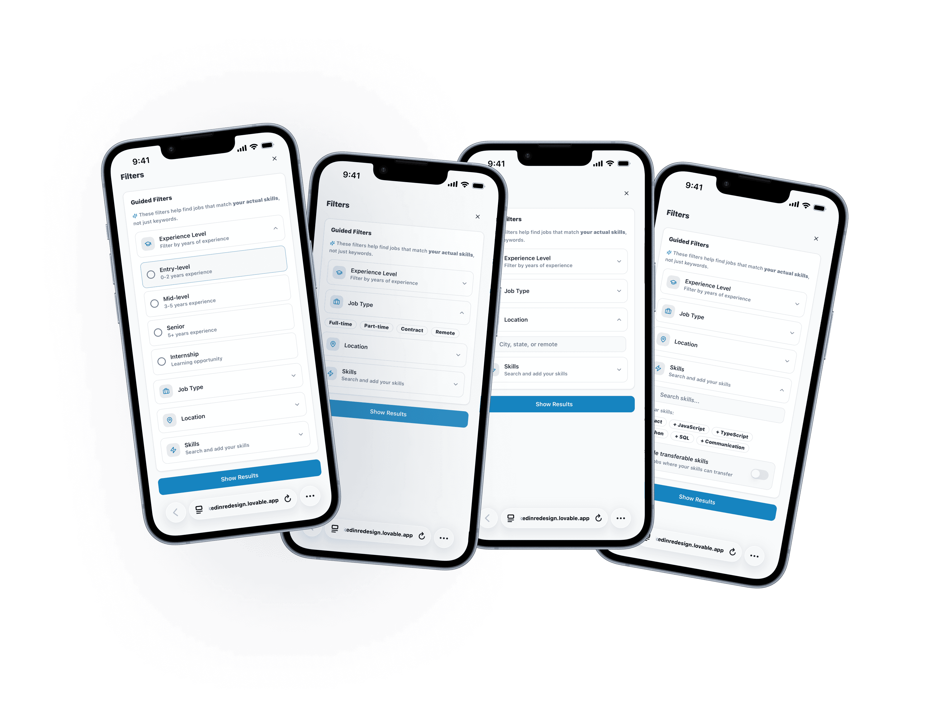
After: Progressive disclosure moves users through filters one decision at a time, reducing front-loaded overwhelm.
Filters should help users narrow their search, not add to the decision fatigue they're already carrying. The current experience front-loads too many options at once — experience level, date posted, job type, remote preferences, salary range — all competing for attention before a user has even started looking.
The redesigned filter flow introduces options progressively, surfacing the most decision-relevant filters first and grouping the rest behind a simple "more filters" option. Users move through the search with a clearer sense of control rather than feeling like they need to configure everything before they can begin.
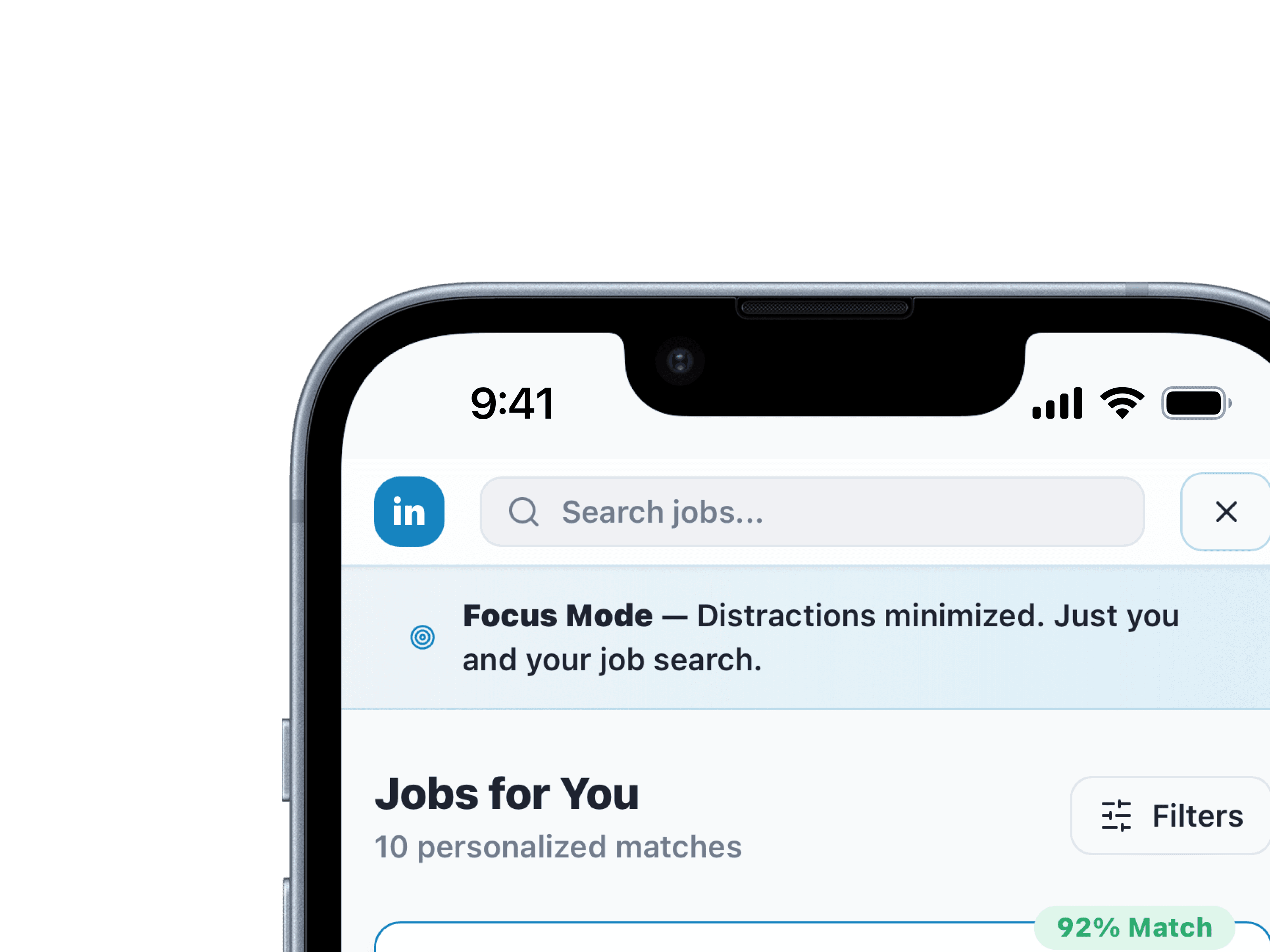
After: Ads, sidebars, and competing CTAs removed — just the job, the requirements, and a clear next step.
That same logic carries into the job detail page. Everything that isn't directly relevant to the application decision — ads, "People also viewed" sidebars, notification badges — is removed. What's left is the job, the requirements, and a clear next step.
Design decision: These two screens solve the same underlying problem from different angles. The guided filters reduce overload at the start of the search. The cleaned-up detail page reduces it at the end. Users who are already anxious about whether they belong in a role shouldn't have to fight the interface to find out.
Recommendation 4: Give users a way to manage their search
Before: A flat list with no status or context.
After: Application status, reminders, and notes in one place — search management built into the platform.
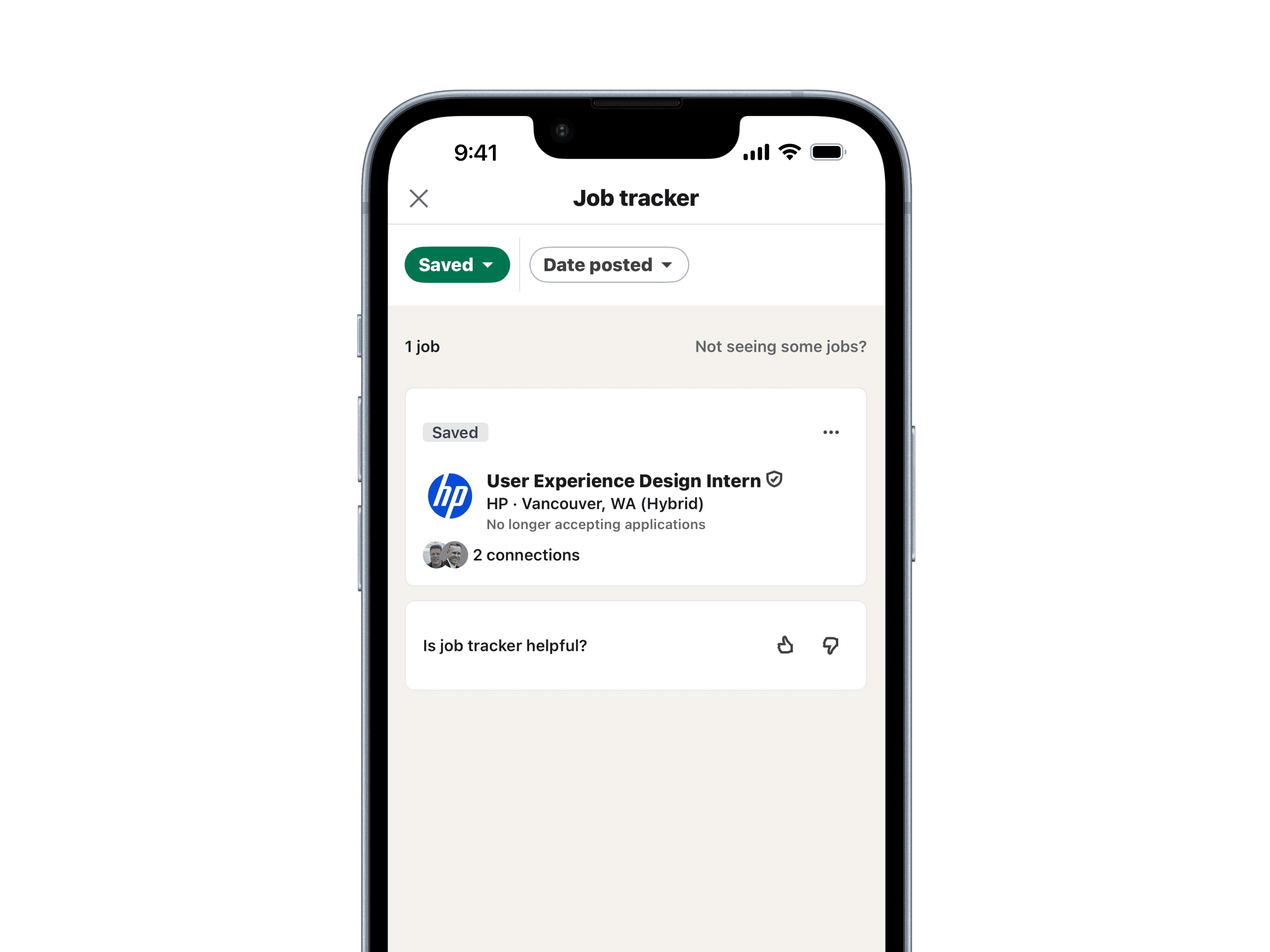
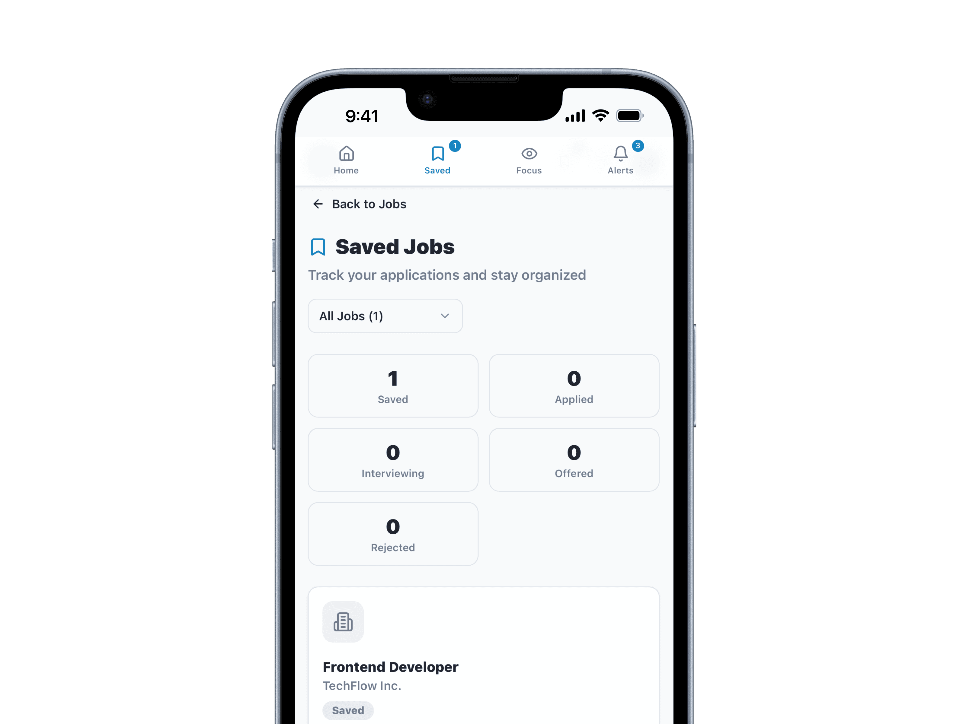
The saved jobs tracker turns passive bookmarking into an active tool. Users can log application status, set reminders, and add notes — keeping everything in one place instead of across spreadsheets, notes apps, and memory.
Design decision: First-generation job seekers are often managing their search without a support system. A built-in tracker reduces the organizational overhead that typically lives outside the platform.
Every recommendation traces back to the same root cause: a platform that wasn't designed for users who don't already know how to use it.
Impact
This project was conducted as a research and design study, so these changes weren't shipped — but the work was grounded in real data from 25 survey participants and 4 user interviews, and the design decisions map directly to documented breakdowns in the current experience.
The research made one thing consistently clear: users don't need a smarter algorithm, they need transparency. Knowing why a job was recommended matters more than the recommendation itself. Reducing cognitive load also isn't about removing features — it's about sequencing them. Progressive disclosure and a cleaner information hierarchy would let users focus on fit rather than fighting the interface. And first-generation job seekers aren't a niche; every improvement designed for users without assumed prior knowledge makes the experience better for everyone on the platform.
If taken to usability testing, the primary metrics I'd track are time to assess job fit on a redesigned listing, confidence rating before and after interacting with the match score feature, and task completion rate for the filter flow compared to the current experience.
Reflection
This project pushed me to be more disciplined about the gap between research and design. Findings don't automatically become solutions — there's real work in deciding what to prioritize, what to simplify, and what to cut. The filter redesign is a good example of that: the first version solved the wrong problem because I hadn't interrogated the finding closely enough. Catching that mid-process and changing course was the most valuable part of the 8 weeks.
Next Steps
Run usability testing on the redesigned flows to validate whether the changes actually reduce confusion
Work with engineers to assess what's technically feasible within LinkedIn's existing system
Explore how preference settings could give users ongoing control over their recommendation profile